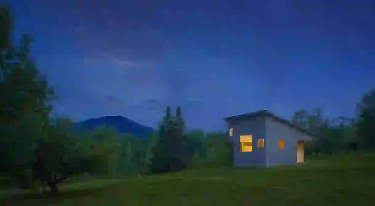
Vermont’s Most Charming Tiny Home Made for an Artist

Elizabeth Herrmann Architecture + Design built an award-winning micro house in Vermont for an artist on an extreme budget. The firm’s president and founder, Elizabeth Herrmann, discusses how she created a sense of definable space within 430 ft.² and how it quickly became America’s most charming tiny house.

One of the biggest challenges with designing a micro house is finding a way to make the interior feel spacious and comfortable, despite the small size. Elizabeth Herrmann designed a 430 ft.² home for her artist client (on a very tight budget) and was determined to make the space as liveable as possible, without sacrificing traditional home amenities and features.
“Even though the house was really small, we didn’t want it to feel boxed in. We can shove ourselves in little boxes and bounce off the walls, but I don’t think it makes us happy. So comfort, happiness, and well-being are super important,” she said in a phone interview.
“There’s something very pleasant and peaceful about being there. Sometimes when you’re in a really tiny place, it’s very agitating because it feels claustrophobic, or dark, or like you want to be somewhere else,” she continued. “But it was really clear that this has to be the kind of place where [my client] could live comfortably and not just hang out for a short period of time.”

The home, which boasts spectacular views of the neighboring mountains, isn’t a temporary living space or a secondary home. Herrmann notes that although her client is an artist, he lives rather minimally and didn’t want any art on the walls. “He doesn’t do art in his home at all, it’s more sort of a little sanctuary for him. His living style is so pared down.
He doesn’t have a single bit of art on the walls. He wanted it to be clean and just uncluttered,” she continued. While she notes that not everyone can live according to minimalist standards, the house works well for him.
Rather than display art on the walls, Herrmann strategically placed the windows so that they reveal certain elements of the outside world. In a sense, the window frames resemble picture frames or viewing boxes, as if nature itself is the real artwork.

“There’s a lot of glass for such a small house, so it has these very specific views to the mountains,” she said.
“The ribbon of the ridge shows through this long, skinny window and it catches the mountain ridge right in the middle. And every view is very particular and almost zen-like. Instead of using his paintings, we used the windows.” Herrmann used a very light interior palette, so that the eye is naturally drawn to the outside and doesn’t focus on the frame of the windows.

CREATING A SENSE OF SPACE
Another challenge with designing a tiny home is creating the sense of definable living areas. Each space within the house has its own particular focus and sense of place. Herrmann attributes this to the sloped roof: “The low side [of the roof] is where the bed nook is, which really feels like it’s its own little space. The hallway is kind of a transitional space that leads to the bathroom, and also serves as a dressing area.”
“With a lot of tiny houses, the door to the bathroom will be right off the kitchen, or right out of the eating space. And it’s weird and really uncomfortable. So having it off to the side and private, is very important [in creating that sense of space],” she added.
“As the roof rises to the rest of the house, it opens up to the more public areas: the places you might hang out with guests, like the kitchen or the center [living] area. When you’re sitting on the sofa, it feels like you’re in a different zone. They all overlap and it’s open, but you do feel like you’re moving from one space to another.”

DESIGNING ON A BUDGET
“[My client] had a very strict budget. It was challenging, but I knew we could make it work. As long as he could remain very flexible, I knew we could build a house,” she explained. “Although this house was the least expensive house I’ve ever built, it was also the most expensive cost-per-square foot.”
Necessity breeds creativity, so it’s not always a bad thing to have a budget: “I think a lot of people are thinking smaller now. The trend is that in direction. And for people who want a custom home and like good design, if you don’t have a budget that forces you in that direction, which isn’t necessarily a bad thing, you may not do it.”
At the end of the day, her client was very happy with the results. And news of the charming little house got around: “I’ve been asked by a lot of people ‘Can you sell me the plans for this house?’ I haven’t to-date done it, because it is really site-specific and I designed it specifically for this guy,” she said.

“But with some modifications, it can almost go anywhere. It’s the type of shape that lends itself to good solar exposure or different types of views. It’s a construction that can work in different climates, so I think it could work in a lot of different places.”
A prototype of the micro house may be coming in the future, Herrmann says, one that is portable and can even be turned into a kit and moved site-to-site.
Elizabeth Herrmann’s Vermont micro house design earned an AIA New England Award and the Best Contemporary Category in the 2016 Marvin Architects Challenge.


