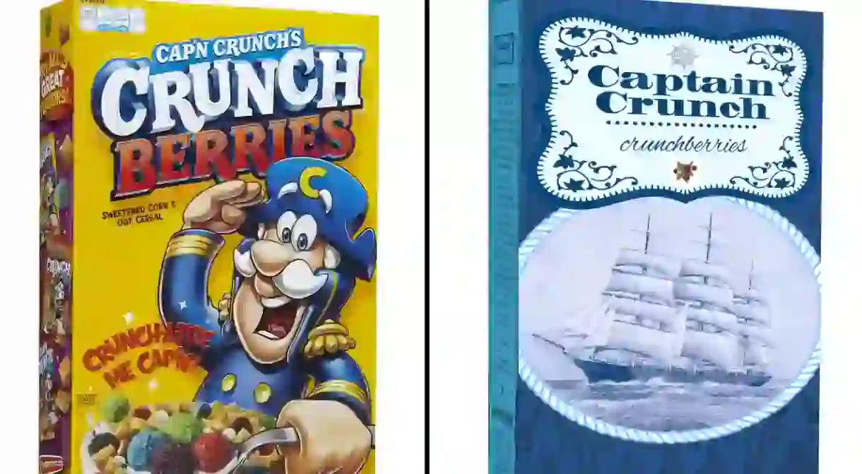
Junk-food Packaging Gets a Gourmet Rebrand for Hipsters

Junk-food packaging gets reimagined for hipster culture, but it’s a bit more subversive than you’d think.
Snack food seems to getting all the attention lately. From Migos’ “Rap Snacks” (aka “the official snacks of hip-hop”) with a dab of ranch to this new creative project by designer Dan Meth, the world is starting to see snack food in a ‘brand’ new way. These childhood throwback edibles get a full-on gourmet makeover for millennial culture and we’re left to question just how much design influences what we eat.
It’s no secret that smart branding and packaging affects our product consumption, but rarely does one pause to think about food in these terms. While browsing the shelves at the grocery store, do you ever stop to think about why you pick one brand over another, even though the contents could be the same?
We spoke to Dan Meth about his tongue-in-cheek design project and what it says about our consumerist society.

Culture Trip: So Dan, do you have a name for this particular project?
Dan Meth: It never really had an official name, but I like calling it “Rebranding.”
CT: Do you actually build these designs, or is it all digital representations?
DM: Yeah, it’s all digital. I didn’t actually build the packages, they’re sort of stitched together from different images.

CT: They’d definitely be interesting to see in real life, too. I feel like they’d sell well, especially in Brooklyn. What was the inspiration behind the project?
DM: There’s a very sophisticated graphic designer in New York named Louise Fili, and she runs a small company repackaging food products. [I went to a lecture of hers] and had the idea to take the style and just see if I could make real junk food look classy.

CT: Why junk food though?
DM: Well, just because it’s the polar opposite of marketing. It’s the tackiest packages with the least artisanal foods I could think of.
CT: And by repackaging them in these… well, what would you call the aesthetic exactly? I did see others call it ‘hipster repackaging,’ but would you say you agree with that? Or would you say it’s something maybe a little deeper or different altogether?
DM: I guess there’s a hipster element. I think it’s sort of like foodie, gourmet, and maybe even a little Eurocentric. I feel like American hipsters are very taken in by European [culture]. Like, if you want a touch of class, you add this European element to it.

DM: I suppose so, yeah. I mean I did do Fruit by the Foot, which I inaccurately translated into French, and a lot of commenters have noticed. I feel like in the last 10 years, food products in America have reached for a more sophisticated branding. Even Trader Joe’s, which is not known to be the most gourmet food, has very nice branding and packaging. It makes you think about the foods differently.
CT: Yes, and it also makes you think about the sheer power of marketing, even when it comes to something as simple as snack food. To me, this project speaks to the power of branding, the power of marketing and how we, as a consumerist society, can be so easily duped in a way.

DM: Oh absolutely, yes. These are foods that many adults wouldn’t ever consume or ever want to buy. They’re kid foods. When you put them in this kind of packaging suddenly they seem maybe a little higher quality; they seem less like a guilty pleasure and maybe like the ingredients are going to be better or it’s going to taste better.
CT: For instance, the packaging for Slim Jim almost makes the food seem like they’re cigars. Even if you’re not a real smoker, you can have one a night, as a treat, so long as you’re not smoking packs of cigarettes a day. It’s like a reversal in the brain that I think is really cool.
DM: Yup, that’s it, you got it.

CT: Would you say that this project is saying something a little subversive about American culture or millennial culture? What’s going on underneath the surface of all this?
DM: I think in the larger sense it’s about how appearances—or what’s on the outside—don’t always reflect what’s going on inside. We shouldn’t judge something by its superficial appearance. I think it is about hipster culture and millennial culture in a way, but there’s never not been gourmet packaging that changes over time. So in a larger sense, I think it’s about not evaluating things from how they appear on the outside.

CT: Are you working on anything else right now that speaks to the subversive side of consumerist culture?
DM: The theme of this is also [apparent] in this graphic novel series I’m doing on Instagram. It’s about the deceptive appearance of the world around us.


You can check out more of Dan’s work on his Instagram here.


