These Eye-Popping Reimagined Oscar Posters Are a Thing of Beauty

It was 30 years ago this week that Andy Warhol passed away. A leading light of the 1960’s New York art scene, Warhol left an indelible mark on the culture around him and it’s a legacy that continues to this day.
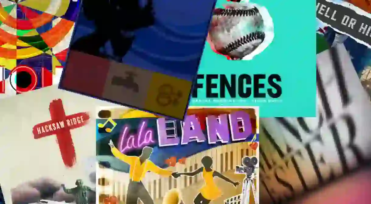
To commemorate his talent, whilst looking ahead to this weekend’s Oscars, the design team at Shutterstock have reimagined each of this year’s Best Picture nominees in the style of a particular pop artist. Here, each designer in the team discusses the overarching themes from their chosen film and the artistic inspiration behind their posters.
Arrival (Artist Inspiration: Roy Lichtenstein)

Alice Lee: ‘I love Lichtenstein’s comic style and bold colours, and I used it to bring a totally different perspective to Arrival by adding a sense of fun. I made Amy Adams’ character into one of Lichtenstein’s heroines, trying to make sense of her extraordinary situation.’
Fences (Artist Inspiration: Andy Warhol)

Terrence Morash: ‘Watching Fences, I was struck by the frequent presence of a tethered baseball; it seemed to act as a symbol for unfulfilled dreams and stunted potential. I recreated it in the style of Andy Warhol’s gun series. That series was a commentary on culture and mortality, which seemed like a good fit for this poignant film.’
Hacksaw Ridge (Artist Inspiration: Richard Hamilton)

Brandon Lee: ‘Hacksaw Ridge tells the true story of Desmond Doss, a combat medic who saved the lives of 75 wounded soldiers during the Battle of Okinawa without firing a single bullet. Inspired by Richard Hamilton’s style, I gave each piece a cutout aesthetic and substituted the real soldiers for toys. The red cross is a nod to both Doss’s role and his strong faith.’
Hell or High Water (Artist Inspiration: Robert Rauschenberg)

Michael Wong: ‘Hell or High Water follows two bank-robbing brothers and the two detectives that are trying to catch them. Like Robert Rauschenberg’s “combines”, the film has a strong undercurrent of political references and often makes unexpected comparisons between the socio-political climate of the past and present.’
Hidden Figures (Artist Inspiration: Idelle Weber)

Alice Li: ‘Hidden Figures shines a light on the untold stories of three black women who were integral to the United States’ space program. It made me think of another woman in the 1960s whose work went unrecognized because of discrimination – the artist Idelle Weber. I used her signature silhouette style to frame the characters in the film.’
La La Land (Artist Inspiration: Eduardo Paolozzi)

Abbey Katz: ‘La La Land is a tribute to old Hollywood musicals and classic jazz but with a modern twist. I felt the colorful collage work of Eduardo Paolozzi matched this feeling of old and new. Just like the film, his work has a feeling of energy and fantasy with serious undertones.’
Lion (Artist Inspiration: Bruce Gray)

Florence Lau: ‘Lion is about Saroo, a 5-year-old boy who got lost and grew up in a foreign country, eventually finding his way home years later using Google Earth and his scattered memories. That sense of chaos and fragmentation reminded me of Bruce Gray’s work. I matched the segmented circles from Gray’s paintings with a key element from Lion, the Jalebi, an Indian dessert that triggered memories of home for Saroo.’
Manchester by the Sea (Artist Inspiration: Ed Ruscha)

Eric Sams: ‘The two Ruscha-like drawings represent Manchester by the Sea’s multiple timelines – the top illustrates the foreshadowing of the film’s climax and the lower portion reflects the quiet heartbreak of its aftermath. I split the title in two to symbolize the fractured relationships of the people in the town and used a muted tonal palette to reflect the heavy subject matter.’
Moonlight (Artist Inspiration: Peter Blake)

Kate Crotty: ‘Moonlight focuses on the personal journey of Chiron, a young man trying to find himself and his place in the world. It’s a commentary on social ills like poverty, drug abuse, and homophobia. The film is split into three chapters in Chiron’s life, so I incorporated Peter Blake’s use of grids, as well as simplified imagery, to represent the forces that shaped his life.’


