Label of Love: Five London Breweries Using Great Design To Sell Beers

As specialist breweries vie for customers’ attention, eye-catching labels have become part of their brand building – and a nice showcase for designers and artists. We’ve taken a look at five London breweries that have perfected the art of the label.
The microbrewery revolution in the UK hasn’t just meant a larger selection of interesting beers in pubs and supermarkets – it’s also meant that labels have gotten a lot more exciting. These days, it’s the rule rather than the exception for breweries to use graphic design and art on their bottles and cans, and label art has become a design field in its own right. Big names are having a go at it too. For the launch of the new Switch House at Tate Modern (now renamed the Blavatnik Building), design legend Peter Saville created a graphic identity for the institution that he also adapted onto a Switch House beer can.
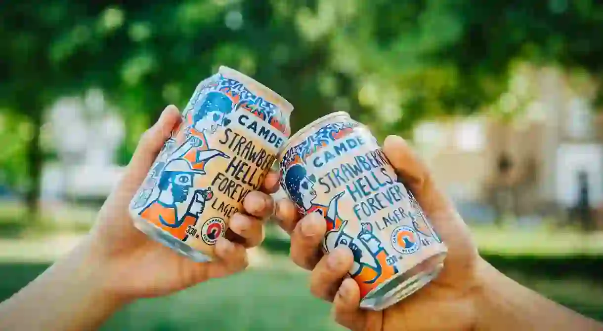
Camden Town Brewery was one of the first London brands to use labels with a distinctive look. While the company’s evergreen beers, like the Hells Lager, have a nicely typographic style created by Studio Juice, the brewery also regularly works with artists and designers for one-off beer labels.
Charlie Hood of London’s Beach Gallery has helped curate a lot of the artworks used by Camden in the past, for both beer labels and signage. He explains that since people often start craft breweries as a hobby, they tend to get their artist friends, or artists whose work they admire, to do the labels. “Some are great, and some suck. Now the bigger, corporate breweries are trying to get into this, retrospectively, but you can tell when it’s not authentic and they’re just jumping on the bandwagon. A good label does help to sell beer – 99 percent of craft beers taste the same,” he adds.

At South London favourite Partizan Brewery, artist Alec Doherty’s illustrations adorn the bottles, and he’s also created the fun, sculptural beer taps in Partizan’s Bermondsey taproom. Doherty’s designs often feature lots of eye-catching characters, and his labels are bursting with bright, joyful colours, which means they really stand out on the shelf. Another South London brewery, Gipsy Hill, has labels by Marcus Reed that feature actual staff from their bars, as well as the founders themselves, which gives them a personal touch – and means that you can “collect” their team.
Sometimes it’s all about a great idea. The text on Walthamstow-based Wild Card Brewery’s labels was created by graphic designer Marc Cowan. According to his website, he worked with design and typography “based on historical references to reflect the traditional brewing process of the brewery.” The logotype is based on text found on taxation stamps that were used for playing cards in the 19th century, combined on the label with illustrations by Valero Doval. The result is a clever design that looks like court cards.

Pressure Drop has some of the coolest packaging around and works with a number of different artists for its labels. Some feature intricate illustrations and some just simple geometric shapes, but they usually have the brewery’s logo and the name of the beer in the same place. This means they’re easily recognisable as a series and makes for a stylish, coherent design.
For artists, the chance to work with a beer brand can also be a good way to gain more recognition. Hood says: “It’s generally a cool thing to work on, and there’s quite a lot of freedom. When you look at Keith Shore’s Mikkeller work, or Alec’s at Partizan, you can really see it evolving as the years pass, so I think on that scale it’s a good way for artists to test stuff out in their commercial practice.” And for beer lovers, it’s another good reason to support local breweries – and artists.


