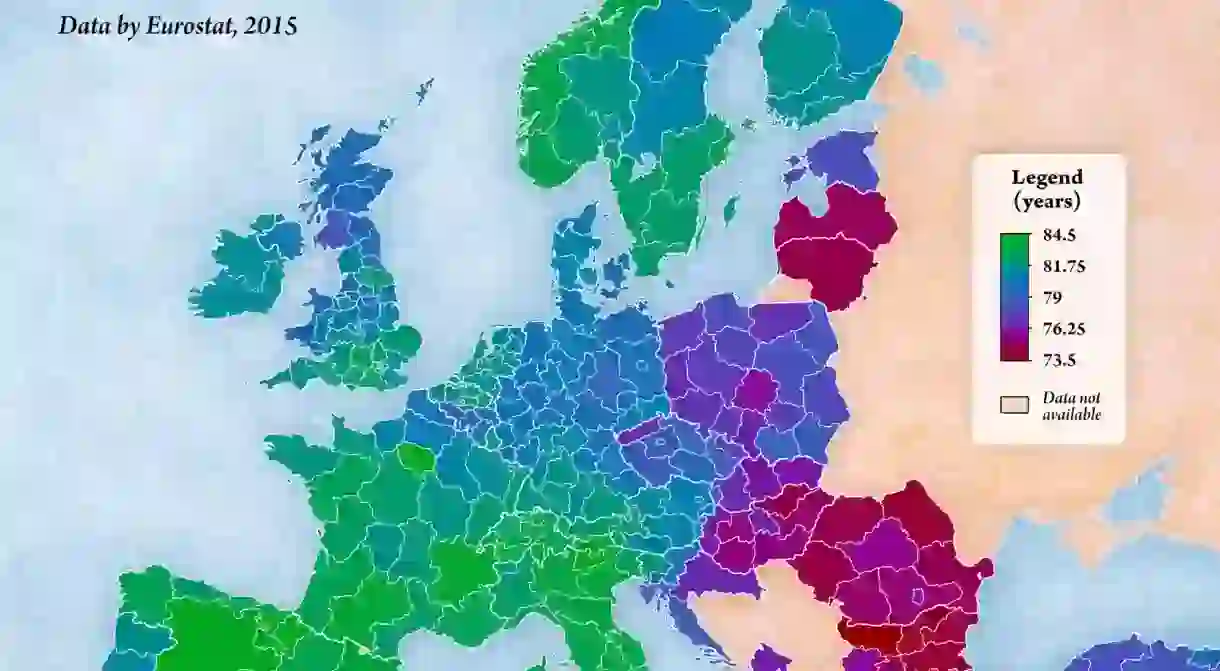
This Map Of Europe Shows You When You're Going To Die

If you could find out when you were going to die, would you? Or would you rather it was a surprise?
If you’re not keen to find out, maybe don’t look at this map. It shows the average life expectancy at birth of European regions.

Created by map master Jakub Marian, it uses data by Eurostat from 2015 to display the life expectancy of different countries by NUTS 2 regions (NUTS is the Classification of Territorial Units for Statistics or Nomenclature des unités territoriales statistiques. NUTS 2 regions are distinguished by regional policies). Jakub points out that Eurostat doesn’t collect data for every single European country – country-level statistics can be found on his map here.
Jakub writes: ‘Life expectancy at birth is defined as the theoretical average length of life of people born in the given year, assuming that age-specific mortality rates remain constant.
‘It is, therefore, just a way to characterize current mortality rates by a single number that is easy to understand, but it is likely an underestimation of the real average length of life we can expect, considering that mortality rates are dropping in most countries due to advancements in medicine.’

The fascinating map shows that people living in Madrid in Spain have the highest life expectancy, living to 84.5. Those in the Île de France in France, Trento in Italy and Navarre in Spain tied for joint second place, all coming in at 84.
The lowest life expectancy can be found in North West Bulgaria, with residents living to 73.5.
What’s the average life expectancy in your region?


