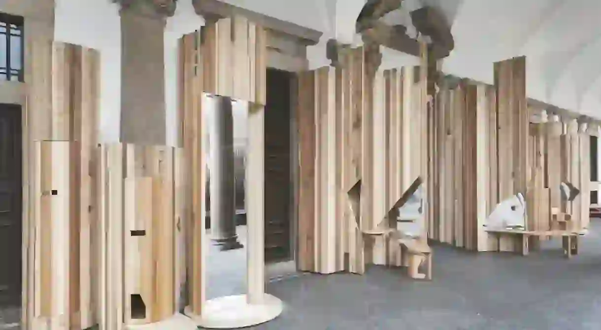
'Too Good To Waste' Installation in Milan Showcases the Beauty of 'Unpopular' Woods

Native Italian architect Benedetta Tagliabue and UK-based furniture brand Benchmark collaborated to create the beautiful ‘Too Good to Waste’ installation showcased during Milan Design Week, which is designed to promote a more sustainable use of less popular wood.
While we hear many stories about forests rapidly disappearing, we often don’t hear about the ones that are thriving. In fact, the vast American hardwood forest has more than doubled in the last 50 years. But the problem is the fickle nature of fashion – these timbers simply aren’t ‘on trend’ and therefore the potential of this timber is not being tapped into, while the precious resources of popular species is being put under strain. The ‘Too Good to Waste’ installation seeks to question the delicate relationship between timber consumption and fashion. Home & Design editor Charlotte Luxford spoke to Benchmark’s co-founder Sean Sutcliffe in Milan about the project initiated by the American Hardwood Export Council.

Culture Trip: How did this project come about?
Sean Sutcliffe: What I’m really interested in is this issue surrounding forests and fashion – the four types of woods we’ve used here for the installation account for more than half the mass of hardwood growing in North America, which is a massive amount, but sadly they’re all out of fashion.

CT: So what woods do we have here?
SS: I remember when cherry wood was so popular and very expensive, but now it’s much, much cheaper as no-one’s really using it. Similarly, with soft maple – plenty of people use the hard variety, but no-one seems to really want the soft version, which I really don’t understand. We’ve also got tulipwood, which is mainly used as a wood to paint over as many people don’t tend to like the slightly green tone of it, but I think it’s worth more than that. And lastly there’s American red oak, which just isn’t popular – everyone wants European white oak.
CT: What was the inspiration behind the installation?
SS: In order to convey the message that these woods can be beautiful, the American Hardwood Expert Council (AHEC) contacted designer Benedetta Tagliabue, who is a delight, and she drew her inspiration from the building here at the Università degli Studi di Milano and its somewhat fragmented elements, she imagined these kind of forest columns – the raw wood portrays the tall trees of the forest and then out of that emerges these beautifully polished pieces of furniture and the stripes of the different varieties of wood follow through.

CT: What’s the story behind each of the furniture pieces?
SS: There are four columns – there’s one that’s all about mirrors, which is very narcissistic as wherever you sit you are confronted by mirrored surfaces. Then there’s one about sharing and community, with pull-out tables and benches, which is where people would gather together. There’s also the love seat, which is based around the theme of privacy and intimacy, which has soft lovely curves and the last column is about private conversation with seats on two sides, almost like a confessional hole. It carries a serious message, but it’s very playful at the same time.

CT: What’s the overall message of the installation?
SS: We want people to reconsider some of these woods and look at them in a new light. It’s also about embracing the imperfections of the wood – some of the pieces here wouldn’t make the grade because of the knots etc. At the Salone del Mobile fair has a very different tone – the fashion for characterful timber has gone already and this year it’s back to perfect finishes and black ash.

CT: What other trends have you seen while you’ve been in Milan?
SS: The other trends I see emerging are pieces of furniture with very delicate, thin edges, there’s an absolute search for lightness, especially in furniture frames. A lot of stone and marble, but again, very thin on the edges; also plenty of clusters of objects, a lot less wood than a few years ago. Black is definitely back – I haven’t seen that for 10 or 15 years.”
For more information on the project, click here.


