What U-Bahn's Typography Can Tell You About Berlin's History

Berlin’s beloved U-Bahn is one of the most reliable, affordable and well connected in all of Europe, and comes with its own unique story. Above the ground, the city may look like just another European city, but under its surface there lies a fascinating history.
The S-Bahn was conceived in 1880 and like most other cities, it was built in response to the growing population and increased traffic. But when you step into an underground train in Berlin, you are stepping into an opening to the not-too-distant past, since the U-Bahn transported border traffic between West Germany and the GDR.

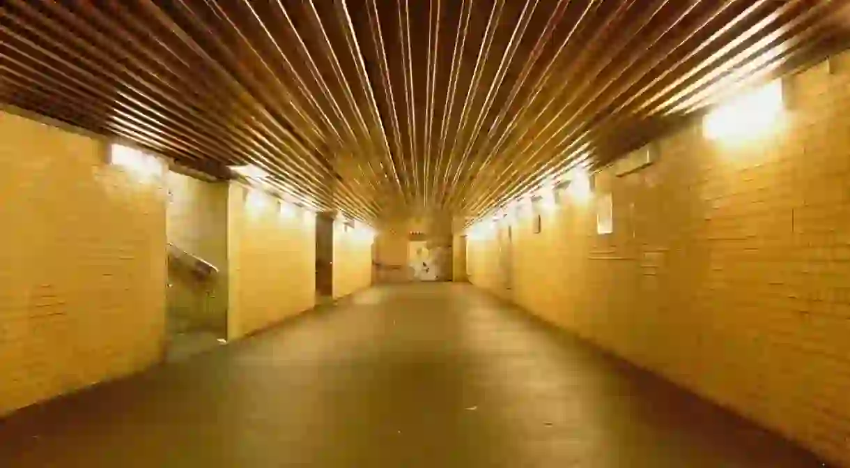
When Germany was divided, some of the borders between east and west proved to be quite random, meaning that some U-Bahn lines from West Berlin would actually travel under East Berlin. It was strictly enforced that passengers could not get off the train until it reached West Berlin again. These stops in forbidden land, later became known among locals as ‘ghost stations’. East German border guards would patrol them from small, bricked-up structures that had just a slit left open for their eyes, where they could ensure that no one got off at these stations.

The typography used for the name of each station also reveals Berlin’s chequered past. From the chosen font of the Nazis, to the retro lettering of the late 70s, each font has its own special character that has become a point of fascination for many.

When the city was divided, the U6 was dotted with ‘ghost stations’. Today some of these stops still give sense of going back in time, with their hand carved and shaky lettering. In 1977, Pankstrasse on the U8 – the line with more ‘ghost stations’ than any other – was actually built as a shelter in case of a nuclear war with its own emergency kitchen and a filtered ventilation system.


