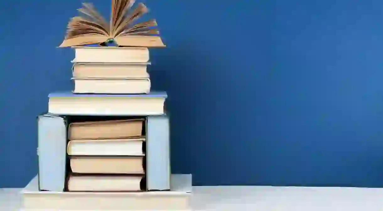
The Backwards Book Trend You'll Never Want to See Again, Ever

Every once in a while, a new home design trend emerges that makes you go, “Whaaa? But why?”
Books are like a gift that keeps on giving – inviting you to spend some quiet time delving into a new adventure. Give me a good book, warm fire, hot tea & cozy blanket and I’ll be the happiest girl ❤️#bookworm #backwardsbookshelves
A post shared by Britt Douglas (@britthdouglas) on Nov 25, 2014 at 7:55am PST
In the scheme of home décor faux pas, the backwards book trend has to be the worst. Unlike other horrendous design trends, this one is so bad it almost feels almost offensive; as in, are you shaming your own books? What’s going on over there?
When it comes to questionable home décor, the culprit is normally because of a blatant dismissal of one principle: form follows function. It’s not to say that every item in your home has to have a specific function—some things are just for aesthetic and that’s OK, while some things have a purely sentimental level. And that’s OK too.
But when it comes to books, their role is pretty clear: to be seen and read. So why intentionally subvert that function?
Perhaps that’s why this whole “backwards book trend” is so baffling, so utterly nonsensical. Are we so trapped in an anti-intellectual society that we dismiss even the legible spines of our books?
Are the titles so offensive that we can’t bear to see them glaring at us from their shelves? Does David Foster Wallace’s Infinite Jest or Susan Sontag’s Debriefing mock you with their bold lettering and self-assertion, and must be turned around?
Are we punishing our books?
I discovered the other day (via a text from a friend) that a couple of my Instagram photos were featured on BuzzFeed. I started to get really excited until I went to the article and realized that they were actually poking fun at people who style their books backwards. Oh well, @buzzfeed thanks for the shout out regardless. #youwinsomeyoulosesome #istilllovebackwardbooks 📖❤️
A post shared by Hannah Briggs (@thistle.harvest) on Apr 2, 2017 at 1:51pm PDT
Needless to say, it’s pretty baffling.
We can hyper-analyze the “why” of this trend until the point of exhaustion, but at the end of the day, it comes down to this: it just doesn’t look good. And perhaps more importantly, it doesn’t make sense. Some have said the trend is to bring a sense of uniformity to a room (in the form of a sandpapered, beige blandness), rather than highlight diversity of color and texture.
For many book lovers (and design lovers) out there, this trend feels vaguely dystopian. It’s an unintentional censorship of words. And it’s for one type of person: someone who must really hate reading. It’s for someone who views books as mere aesthetic tools, as props in the absurdist theater that is their home.
Esconder el lomo de los libros para mostrar la parte de las páginas hacia afuera es una tendencia decorativa poco práctica pero MUY estética. Conoce más sobre ella en el link en la bio. #DuesHome #IdeasyEstilos . . . #home #decor #homedecor #decoracion #interiorismo #interior #interiordesign #librero #book #books #bookshelf #backwardsbooks
A post shared by Dues Home (@dueshome) on Jan 8, 2018 at 12:55pm PST
The backwards book trend is for those who couldn’t care less about distinguishing Nietzsche from Elizabeth Gilbert. Those who like the “idea” of books, rather than actual reading.
So can we all agree to stop glorifying this “book shaming” trend? Let’s put it to rest and collectively decide to never, ever do it.
Just when we thought that minimalism could never be impractical, the #backwardsbooks trend is born. 🤦🏼♀️ Read more through our link in bio.
A post shared by Word Salad (@wordsaladau) on Jan 22, 2018 at 2:08am PST


