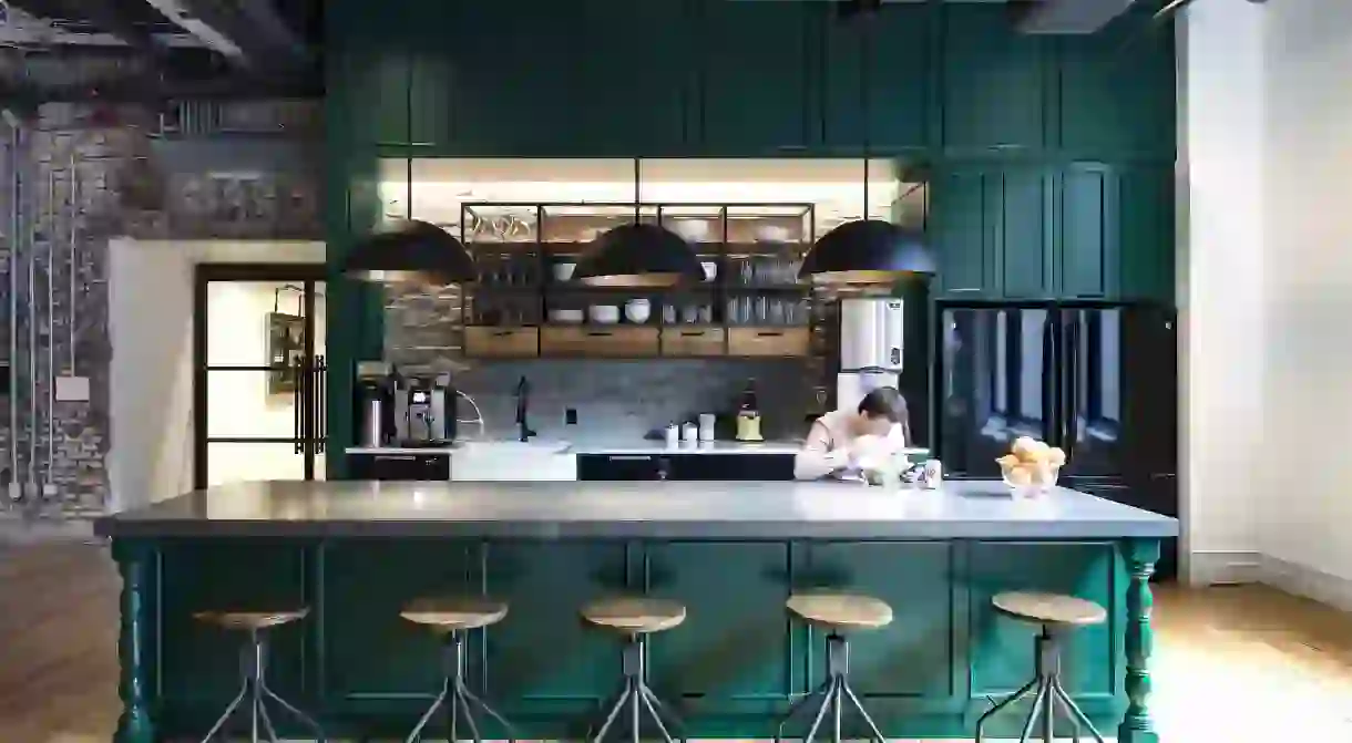
A Look Inside One of NYC's Coolest Office Spaces

Edrington, the brand behind some of the world’s most popular spirits, including The Macallan and Cutty Sark, recently opened a new “spiritual home” in the Flatiron District, and it may just be the most consciously chic office space in New York City. Culture Trip took a tour of the luxe new digs, designed by architecture and design firm Gensler, and got an inside look at the ethos behind this complex design schema.
The downstairs lobby of Edrington’s new office space acts as a portal into the past. An elegant, crystal chandelier hangs from the ceiling and a series of framed vintage memos adorn the walls, including a telegram from Winston Churchill. “From Yalta,” the note reads, “The water was not fit to drink. To make it palatable, we had to add whiskey. By diligent effort, I learned to like it.”
Unlike Churchill’s whiskey, it’s hard not to immediately love Gensler’s creations for this space. It’s not an acquired taste, but an immediate, palatable experience. In the 25,000 square-foot office, four floors up, a mixture of the company’s historical past and contemporary vision comes into focus. Edrington’s multi-functional office space takes up the entire floor, overlooking 23rd and 24th streets, and offers 60 employees the option of 180 places to sit.

“It was about giving people choices,” says Marc Bromfeld, Edrington’s director of corporate affairs and social responsibility. In New York City, where most people live in small apartments, and spend much of their waking time in an office, having ample space is especially important. “The idea was to give them flexibility, but also a space to breathe,” Bromfeld tells me.
With seven enclosed conference rooms and five phone rooms, all meticulously designed according to the specific ethos of Edrington’s various brands, the office is not only high on functional flexibility, but big on thoughtful design. Every detail is perfectly curated, from the floor coverings to the fabric choice lounge chairs, to the accent walls – bringing out a refreshingly playful ingenuity in each curated nook. There’s also a “quiet car,” which has the feeling of a library (no talking and no cell phones), and a wellness room where employees can meditate, practice yoga, breastfeed, or just sit unobserved from the rest of the office.

For the conference rooms, “the wallpaper serves a unique purpose for the brands, with some offering moments of discovery and others evoking the essence of the brand history,” Gensler’s global leader for design experience, Jean Anderson, tells Culture Trip. Cutty Sark, for instance, was the first liquor to go into space, so that room features astronaut wallpaper. The room includes nautical lights (Cutty Sark is also a British clipper ship) and the furniture is designed to reflect the ’60s & ’70s, when the scotch brand was in its heyday. In the Famous Grouse room, the wallpaper is made to look like feathers.
The Brugal room, on the other hand, utilizes netting accents with a tropical vibe, including sugar cane wallpaper, an intentional nod to the brand’s Dominican Republic roots and the bottle’s signature netted encasing. Anderson calls it a “story-driven, experiential” design—and it’s an accurate description of the feel of the place, even as a visitor.

And then there is the mindful yet decorative lighting, which Anderson says also contributes to the overall experience. The entrance of the headquarters is “dramatic and bold,” she explains, whereas the rest of the lighting complements the “character and integrity of the building… rather than that of a corporate office.” For the main event space, design input from local New York bartenders was used to create the bar.
“We asked them what they’d want in their ideal bar. So [now] we have our CO2 built-in, a glass dishwasher, a flash dishwasher, an ice cube maker… and it’s set up to have a [wide] space,” says Marc. Dramatic, spider-like copper lighting hangs down from the ceilings in this area, and rather than evoke a dystopian, creeping vibe, they actually give off a welcoming, old-world energy.

But when you’re designing a corporate office for a company that represents a large number of brands, finding cohesion in the space can be a challenge. Anderson highlights the fact that Edrington wanted to “respect the history and bones of the building,” so they took the space as it was and designed the workplace to fit within that framework, leaving the original wood floors, cast iron columns, and tin ceilings intact.
Other examples of paying homage to the past include the old Macallan cask barrels, repurposed to form a remarkable overhead light installation, and an original weathered, fire door (“found within the space when we came here,” says Marc). The fire door now serves as an makeshift accent wall in one of the open areas.

Perhaps the most curious element of Edrington’s self-proclaimed “spiritual home” is the address. Their biggest brand, Macallan, was founded in Scotland in 1824. And their new NYC address? 18 West 24th Street.
“That,” Marc laughs, “was purely coincidental.”


