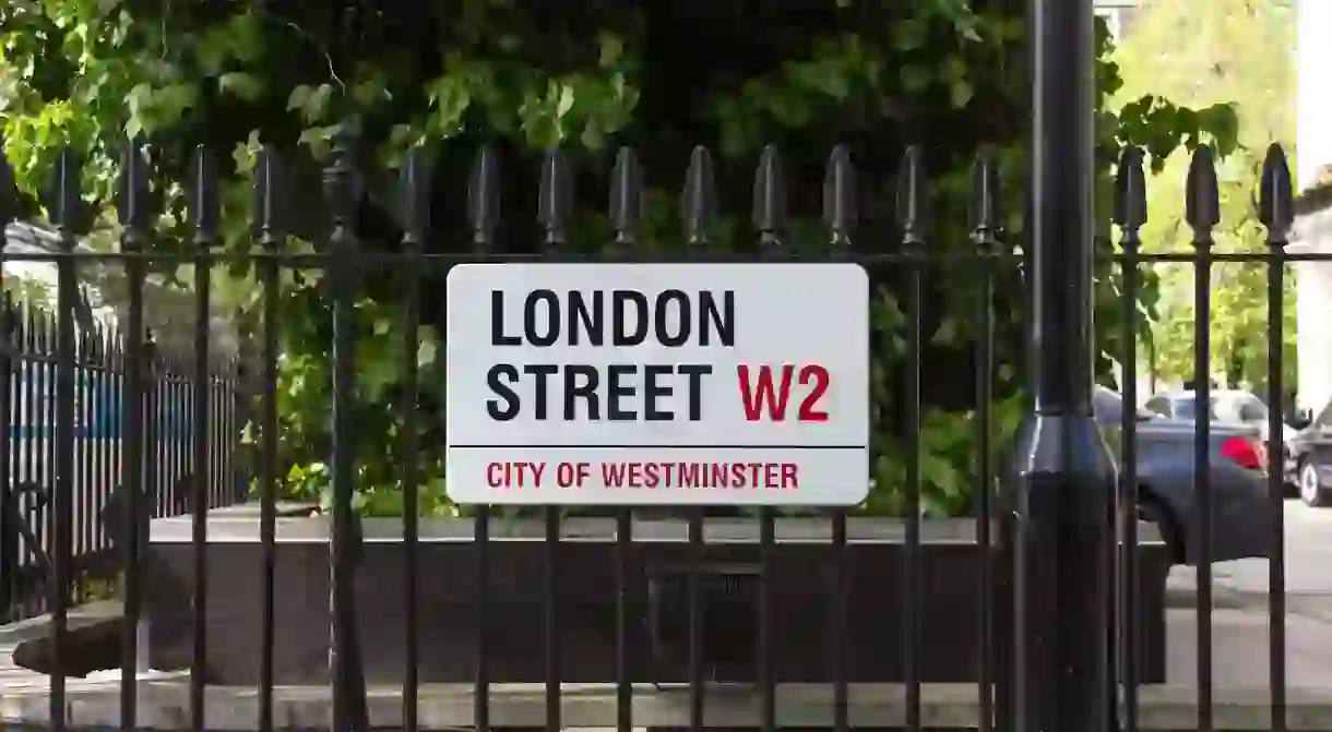
London Street Signs Contain Clues to the City's History

Some London street signs do more than just tell you where you are – they reveal a secret typographical history of the city.
If you spend any time at all walking around London, and especially if you get a tiny bit lost, you’ll notice the characteristic nameplates, with their white backgrounds and black and red lettering, affixed to buildings at street junctions. Every so often, you’ll spot one that looks older, more elaborately designed or simply a little bit weird.
To graphic designer Alistair Hall of We Made This, the nameplates aren’t just signs, they’re typographic marvels. He has been photographing them for his Instagram account, London Street Nameplates, since 2016.
Scrolling through his pictures is fascinating: the differences in typeface and material hold the secret to when the nameplates were made, and tell the story of an ever-changing city. The street signs don’t just signpost a place but also historical events, whether that’s the introduction of numbered postal districts in 1917 to help the female workers who replaced the postmen off fighting in WWI or the reduction in the use of enamel during WWII and steel in the 1950s.

The hunt for rare London street signs
Hall searches for nameplates all over London, finding them on Instagram and Flickr and with the help of people sending him tips. Working off a Google Map, he waits until he’s identified a few of interest in the same area and then walks the streets between them, keeping an eye out for rare examples.
“I’m always trying to chase down a certain kind of nameplate from the 1890s to 1930s with a specific letterform,” he says. “They’re mainly painted on enamel or milk glass and the letters G, C and S have angled terminals [the end points of letters]. I want to find an original sign to find out when they were first made – ideally, I’d love to find a guide sheet to see when they started using them.”
Other unusual nameplates are those with the old northeast postcode, NE, which were changed when it was merged with east in 1866. “They’re rare now, but some were actually put up even after the NE postcode changed to E since people were too snobby to want an east postcode,” Hall explains.

Different neighbourhoods, different styles
If you walk through different London boroughs, you’ll see nameplates in different styles, though they can vary even in the same borough. “This is due to variations in things like the date of the buildings, which parts of the city had money, and if the buildings were damaged in the war or not,” says Hall. “It’s nice that councils don’t think all nameplates have to look the same; it gives different areas a language and flavour, almost like different accents.”
Hall’s favourite borough is Westminster. Its nameplates were designed in the 1960s by the Design Research Unit, but even they have variations. “The original typeface was a bespoke one designed especially for the nameplates, but now it’s been standardised and they’re using Helvetica Condensed,” says Hall, which means people in the know can spot a newer nameplate by its typeface. And it’s not just Westminster Council that creates nameplates in this style. According to Hall, private streets tend to copy Westminster signs because that’s what people think they should look like.
So, next time you’re wandering around London, make sure to look up at the nameplates around you. As Hall says: “They’re bits of the history of the city that you wouldn’t usually notice.”
Alistair Hall’s five favourite London street signs
Chapel Place North, Westminster
“This is a terracotta cartouche, which is something that you usually see on more expensive properties. I like its odd use of lettering – they’ve been placed diagonally on the cartouche. The signature by the architect on the lower right-hand side is also lovely.”

Farringdon Road, City of London
“We know this one is from before 1917 as it doesn’t have a numbered postcode. The blue enamel signs were prevalent once, and have lasted well.”

Jeffreys Road, Lambeth
“This sign is in Lambeth and was designed by Atelier Works. It’s set in Albertus, a typeface that was designed by Bertold Wolpe, who had lived in Stockwell. It’s nice when the nameplates reveal a bit of the local history like that – it engenders pride in the community.”

Martello Street, Hackney
“Quite often you’ll see “formerly” or “late” on one sign, but it’s unusual to have different signs for it. The signs reference different periods, which is lovely. Hackney is an old metropolitan borough, and this sign is from before 1965 – after that, Greater London was created and the signs started saying ‘London Borough’.“

Woodside Lane, Barnet
“Because this sign has a postcode number, we know it’s from after 1917. However, the lower sign with the postcode on it could have been added later on – nameplates get changed a lot. Nice signs like these can evoke or engender a sense of pride in an area; sometimes, you see cheap-looking signs on council-owned streets or buildings, and that seems to say that you don’t need to take pride in the street.”

Alistair Hall is always open to hearing from people if they see an interesting nameplate.


