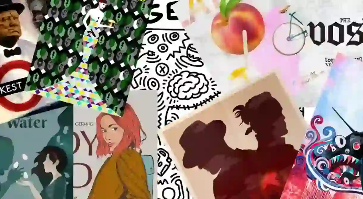
These Re-imagined Oscar Posters Beautifully Capture the Best Picture Nominees

By now, you’re probably very familiar with the Best Picture Nominees at the Oscars and just as familiar with the posters for the nine films selected. If you’re looking for something a little bit different, however, we’ve got a look at these gloriously re-imagined takes on the potential winners…
You might also like: Can This Film Shock the Favourites to Win the Best Picture Oscar?
Call Me By Your Name

This sumptuous poster captures one of the most memorable moments from the film, but also evokes the spirit and ambience we see throughout Luca Guadagnino’s coming-of-age romance.
‘James Rosenquist took imagery from ads, photos, and periodicals and created mysterious, bold compositions with them. His ability to weave together seemingly unrelated items and craft a narrative reminded me of the love story that unfolds between Elio and Oliver. Though they have different backgrounds and are in separate stages of their lives, something beautiful emerges.’ —Tim Harrison, designer
Lady Bird

This is a bold vision, but apt, given that Saoirse Ronan dominates the screen throughout Greta Gerwig’s directorial debut as the titular Lady Bird.
‘Lady Bird is a film about a young woman growing into her own body and sexuality and impatiently waiting for adulthood. Watching it reminded me of Mel Ramos’s work. His images highlight female sensuality and are at once provocative and humorous.’ —Brenda Luu, designer
Three Billboards Outside Ebbing, Missouri

The mixed emotions throughout the film are wonderfully showcased in this design. There’s comedy, pathos and no small dose of brooding on display… just as in the movie.
‘English artist Olly Moss is famous for reinventing movie posters so he seemed like the perfect choice for this project. In a complex movie about a mother dealing with the aftermath of her daughter’s murder, I used Moss’s style to reveal a lot of the details — the grieving mother, the policeman she blames for not doing enough, and the billboards she rents to make her point.’—Jackelyne Catillo, designer
Get Out

This startling visual intentionally opts for a black and white structure. It might take a while to get all the references, but that’s part of the fun and longevity of this poster.
‘Though he’s known for his colourful dancing figures, much of Keith Haring’s work was darker, dealing with violence and fear. That made his style a good match for Get Out, a horror film about racism. I also used Haring’s doodles to represent important elements from the film, including a teacup and spoon, a deer, and a police car.’ —Alice Lee, designer
Phantom Thread

Our favourite film of the nominees, Phantom Thread is just as much about the creative process as it is about fashion. You get a sense of all the themes seen in Paul Thomas Anderson’s movie, not least the use of mushrooms.
‘Set in the fashion world, this film is about the tempestuous bond between a designer, Reynold Woodcock, and his muse, Alma. I was inspired by French artist Malika Favre; her clean, minimal graphics represent Reynolds’ regimented daily routine while the intricate patterns speak to the complexity of his and Alma’s relationship. My poster also references moments from the film including a mannequin and an unusual mushroom.’ —Florence Lau, designer
Dunkirk

Not what you might expect, but as Brandon Lee explains below, the horrors of war can come in many forms.
‘Watching Dunkirk, I was struck by the film’s visceral representation of the horrors of war. In an offbeat interpretation inspired by Takashi Murakami, I used his psychedelic, vibrant style to bring a Spitfire plane to life as a monstrous being, emerging from a void.’ —Brandon Lee, designer
The Shape of Water

We suspect Guillermo del Toro himself would create something like this poster for his fantastical fairytale. The use of green matches the colour we see throughout the film itself.
‘The Shape of Water is about Elisa, a mute woman who falls in love with a humanoid aquatic creature. The film has a distinctive blue-green visual tone that reminds me of Kiki Kogelnik’s work. Kogelnik also had a strong interest in feminism and emerging technology, which tied into Elisa’s role as a cleaning lady in a secretive U.S. government research lab in the 1960s. —Kia Delgato, designer
Darkest Hour

This could have veered into the cheesy ‘Keep Calm and Carry On’ motif we see adorning many tacky postcards and posters in souvenir shops across London, but there’s a bold statement being made here.
‘The pop art movement in the UK originally depicted American culture from an outside perspective, so I thought it was fitting to turn that lens inward by depicting Winston Churchill in the style of British artist Richard Hamilton’s collage/painting of John F. Kennedy. Included in the poster are significant elements from Darkest Hour as Churchill takes leadership of a nation at war.’—Alice Li, designer
The Post

This might look like the most simplistic interpretation of any of the films nominated, but Steven Spielberg’s Oscar contender is an ode to the ‘golden age’ of crusading print journalism.
‘The Post is a film about words. At the heart of the film are thousands of pages that were never intended to made public and the battle to print these words. I found that this plot lent itself perfectly to a typographic poster, and looked to Ed Ruscha for inspiration. He’s best known for distilling pop culture imagery into brief typographical codes and phrases.’ —Jenny Forrest, designer


