The Evolution Of The Premier League Logo

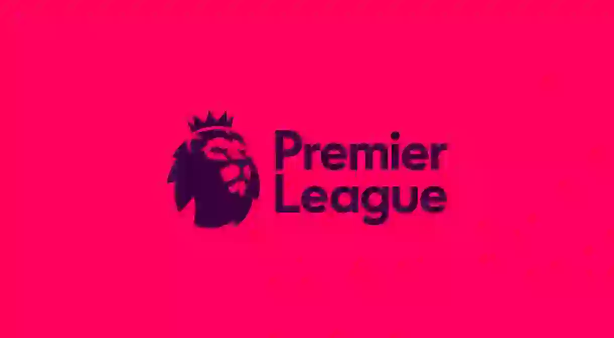
In February 2016, the Premier League announced it will have a new ‘visual identity’ for the 2016/17 season, which begins Saturday.
The new branding, created by DesignStudio with Robin Brand Consultants, keeps the lion iconography, but it has undergone a significant change. Simplified, without sponsorship and with an injection of colour, it marks a distinct shift from previous designs.
DesignStudio told Culture Trip, “The old identity was almost 10 years old and no longer fit for purpose, it didn’t even have an inverted version. From the start we set out to create a digital first, broadcast ready brand so that it worked as an app icon as well as it did on any other touch point.”
Given the Premier League’s evolution, Culture Trip asked Simon Menhinick, Design Director at BEAR, to give his insight on each iteration since the Premier League’s inception:

Simon: ‘The start of the worried lion. Although it looks more like a griffin than a lion and it has these very droopy eyes. As one logo, it is too complicated to be a pure mark – there are too many colours and it all jars with each other. The lion is at the centre but then they’ve added more to it, with the sponsorship, making it diminutive. It reminds me of classic 1980s racing tobacco sponsorship.’

Simon: ‘This is the worst of the lot. Firstly, you’ve got a football in a football which is very odd. Secondly, it’s the start of the full lion, but he’s still got this worried expression on his face. Overall, it’s trying too hard to do too much at once. The black background, the speed lines and Carling logo are all at odds with each other. It’s a mess.’

Simon: ‘The change in sponsorship has clearly led to a re-think. The lion is now pride of place, but is still worried. The different shades of blue make it look disjointed. With that, and the two footballs, it looks like two logos smashed together. They’ve got this triangular holding device which, while it may be eye-catching, is actually quite awkward.’

Simon: ‘The colours are starting to work better together, and the type is more harmonious, but it still has the same feel of two separate logos smashed together. The continuation of having two footballs, one with the lion and one with the sponsor, displays a lack of authority and comes across as very unconfident.’

Simon: ‘What’s nice about the previous lion, if anything, is it has equity in its ownable silhouette, but that’s now lost in this change. That said, this version of the lion is definitely more regal, more engaging and a lot more confident. If it was just the lion’s head it would provide a more satisfactory engagement point.’

Simon: ‘They’ve gone for just the head, and I enjoy its simplicity and confidence; it has nobility and modernity. Clearly, it’s digital first, with their choice of colours, which are RGB colours, not print based. It’s made for devices and TV, not print. I think the crown could be a bit more regal, but they are probably democratising the brand and Premier League with it, making it more accessible.

The typeface could be a bit more ownable, but it’s modern. The lion has a nice weight on the mane, making it feel more 3D. The lockups with the larger head work better, because I think they are more stoic. The test will be if there are to be potential sponsors in the future and if they are complementary to the brand colours, so it will be interesting to see. Overall it works — it’s less elitist and more accessible. Some people may prefer the older style, but I personally think this works far better for their target audience.’


