Meet The Designer Behind Vintage's Beautiful New Virginia Woolf Editions
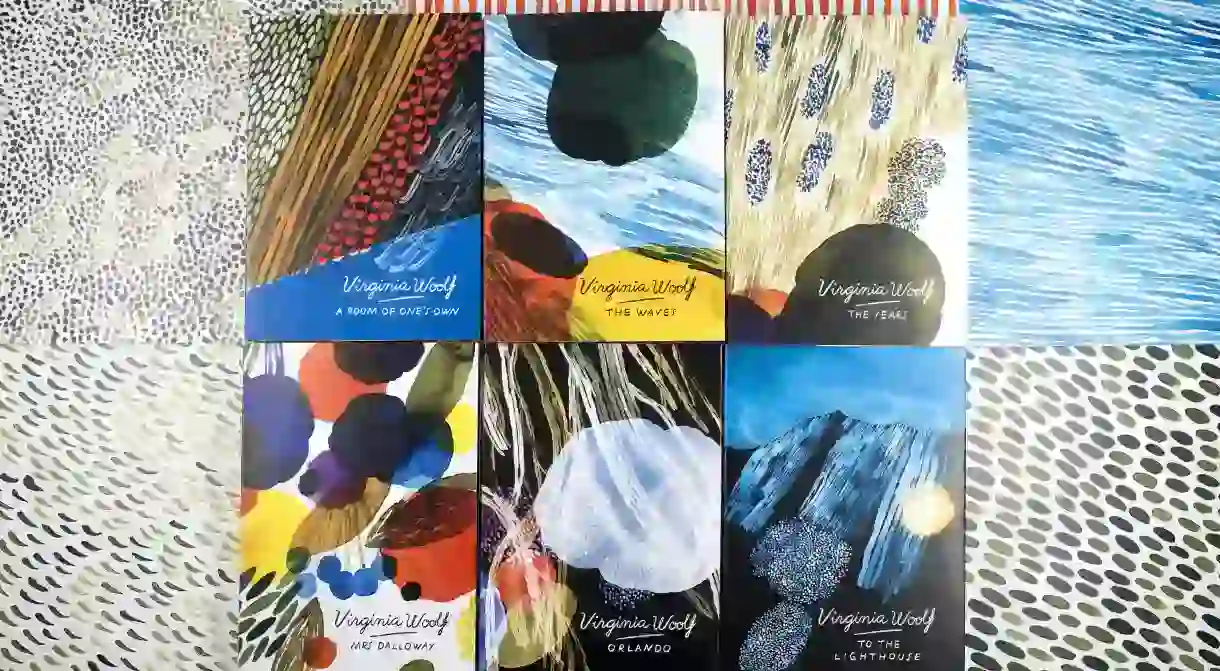

This month saw the release of six new books by Vintage Classics, beautifully-designed paperback editions of some of Virginia Woolf’s greatest works: A Room of One’s Own, Mrs. Dalloway, Orlando, To the Lighthouse, The Waves, and The Years. This series, conceived under the artistic direction of the ever-fantastic Suzanne Dean, features vivid and highly expressive covers courtesy of Helsinki-based illustrator Aino-Maija Metsola. We caught up with the artist to talk about her work, and Virginia Woolf.

First things first, are you an avid Virginia Woolf reader? And, if so, which of her works is your favorite?
I have to say I’m not. I knew something but not very much, for some reason I have been choosing other books and other classics to read. I read literature all the time but I’m quite slow, I’m have never been the kind of person who has a book on hand at every free moment.
Unfortunately I didn’t have the time to read all the six books during the design process because I needed to proceed quite quickly. I have designed some book covers years ago and I always read the manuscript before I started the design process but this time I had to find other ways to familiarize myself with the books as well as I could. I mostly read summaries and also some short parts of the books. But after working with this series of covers I decided I want to get to know Woolf’s texts better. At the moment I’m in the middle of reading The Waves.

What made you do this project?
I was contacted by Vintage and asked if I was interested in this type of project. I was immediately fascinated by the idea as I thought it would be very inspiring to work with Woolf’s texts. Somehow it also felt natural, I quite easily came up with ideas on how I would like to interpret the books in pictures.
What did you set out to do and/or represent for each book? And what do you see as the role of the cover?
I think a cover shouldn’t tell very much. It should catch the eye but I wouldn’t like the covers I design to be too obvious, I hope they would evoke thoughts and questions. In the Woolf covers I tried to convey something essential about the atmosphere of the books but I wanted the illustrations to be rather abstract so that they are open for interpretations. With each of the Woolf covers I simply picked one little detail from each text or some visual image that started to build up in my mind. Then I started painting. As I mentioned earlier I wish I had known Woolf’s works better before starting with the covers so I was first a little nervous about the possibility of completely misunderstanding what is relevant. But I tried to view that as an interesting challenge.

One can perhaps liken your work to that of artists associated with the Bloomsbury Group, in particular the Omega Workshops, as well as Terry Frost. Were they influences? Did you have other inspirations?
The creative director Suzanne Dean from Vintage who commissioned for this project showed me some works by Vanessa Bell, for example the covers Bell designed for Virginia Woolf’s books. I believe she saw something similar with Bell’s work and the things that I have done in the past. I had never thought of that before or looked for influence from her paintings. During the design process I wasn’t actively thinking about this reference as my way of working is quite intuitive. I feel that for me it works best when I don’t analyze too much, when I concentrate on creating my own interpretation and aim to convey something that I see and feel. When I create pictures it never starts with a thorough summary of sources of influence or clear goals. Everything evolves during the painting process.

Did you employ a particular technique for these covers?
I painted the illustrations with watercolors and used computer to develop them further. Although I like to experiment with different techniques watercolor has remained my favorite medium over the years. I love that painting with watercolors is always a little unpredictable and that with this medium I nearly always find the best solutions by accident.
Aino-Maija Metsola’s colorful Woolf editions were published earlier this month in the UK. More information here.


About the author

Simon is Culture Trip's London-based Literary Editor. Born in Paris to journalist parents, he was raised in New York City, where he acquired an inconclusive accent and a taste for argument. His free time is spent much like his work time: reading, writing, and impersonating David Bowie.
Read Next

The 11 Best and Cheapest European Cities to Visit This Autumn

10 Famous Fictional Detectives

The 15 Best Cities in the World for Art

The Best Stone Circles in the UK To Visit Instead of Stonehenge

12 Incredible Historical Towns and Cities in the United Kingdom

The Most Beautiful Towns in Northern Ireland, UK

The Most Dramatic Clifftop Walks in the UK

The Darkest and Most Disturbing Fairy Tales

The Coolest Neighbourhoods in Liverpool

36 Natural Wonders in Europe That Will Take Your Breath Away

24 Belfast Murals You Need to See

The 11 Best European Destinations for a November Adventure
