17 Clever And Creative Book Cover Designs

Those who say don’t judge a book by its cover obviously haven’t seen these imaginative artworks. Providing that all-important pictorial introduction to the words within, the book cover is a crucial element to the reading experience, and works to persuade you past the first page. We’ve picked out 17 of the coolest covers around, that range from the iconic and witty, to the beautiful and thought-provoking.
Last Last Chance, Fiona Maazel
This apocalyptic début novel by Fiona Maazel that covers everything from drug addiction to super-plagues, has a cover that makes you wonder whether hope is all just an illusion. Designed by Henry Yee, it appears as if a rainbow has been shattered in half – a snapped symbol of hope and happiness – hinting straight away at the book’s tragic storyline.
The Paradox of Choice by Barry Schwartz
In his book, psychologist Schwartz argues that the Western world is overwhelmed by the choices in the average supermarket. The hectic book cover does well to reflect this, crammed with a supermarket display of endless bottles, cartons and cans. Cleverly, the nutritional panel on the front doesn’t list a calorie count or fat content but instead details the book’s title and subtitles as well as a review quote.
Eat, Pray, Love by Elizabeth Gilbert
Award-winning book designer Helen Yentus crafted this charming cover to Gilbert’s best-selling travelogue about her round-the-world quest for self-discovery. The words, which represent the theme of each of the three destination in the storyline – the first, written out in spaghetti, is for Italy, where she recovers from a broken heart by eating foods. The pray, spelled out in prayer beads, representing her month in an ashram in India. The third word ‘Love’ is a chain of flowers, representing Indonesia where romance blooms.
The Horizontal World by Debra Marquart
The title of the book is taken literally for the witty cover design, including type face and image of a stormy sky and window pane, are all turned sideways. It’s amazing how many people tilt their head to read it!
Experimental Geography by Nato Thompson
This futuristic cover is highly suited to a book all about landscape, cartography and urbanism. Playing with vibrant block colours, contours and shapes, the minimalist graphic design provides an creative portrayal of the earth’s inner layers, mountainous landscape and sky.
Valkyrie by Philipp von Boeselager
This gruelling account of a failed conspiracy plot to kill Adolf Hitler has a book cover that illustrates the potential power of that fatal shot that never came, with its black-and-white picture of Hitler smudged with a blood-red laser point right on his temple. The author, Freiherr von Boeselager, was the second-to-last surviving member of the 20 July Plot – one of more than 40 assassination attempts that Hitler survived in his lifetime.
The Disappointment Artist by Jonathan Lethem
What can be more disappointing than your ice-cream melting in your hand before you even get a lick? The image speaks out to everyone, perfectly capturing the spirit of the pages within.
Against Happiness by Eric G. Wilson
This brilliantly minimalist cover uses the colour yellow – typically associated with a happy face – as the backdrop to the inverted smile that now looks like a melancholic frown that spells out just the title and author of the book. It’s wonderfully simple, yet effective.
Zoo City by Lauren Beukes
Awarded the 2010 BSFA Award for Best Artwork, the cover of this sci-fi novel designed by Joey Hi-Fi uses the themes of the book to inspire the incredible detailing of fur, feathers, faces and urban skyscrapers that combine to create seriously eye-catching typography.
A Clockwork Orange by Anthony Burgess
This cover was designed ten years after the initial publication of this classic novel to coincide with the release of the 1971 film adaption. Designed and released in a single night after the illustrator’s first attempt was rejected, an image of the protagonist with a cog for an eye was used, now recognised worldwide as a classic.
The Psychopath Test by Jon Ronson
This super cool cover brings together two contrasting styles to reflect the split personality disorders associated with psychopathy. The plain black and white cover illustrated with an innocent bunny rabbit is seemingly ripped down the middle to reveal a wild tiger in bright colours and textures, hinting at what can hide beneath apparent normality.
The Great Gatsby by F. Scott Fitzgerald
Among the many covers for Scott Fitzgerald’s iconic classic, this one stands out for its ultra cool portrayal of Gatsby. The monochromatic figure oozes elegance, and the blacked-out face alludes to the character’s elusiveness. The ‘Y’ spelling out Gatsby as his cocktail glass is a winning final touch.
Things I’ve Learned From Women Who Dumped Me by Ben Karlin
When it comes to a book about learning lessons by dissecting heartbreak, having a cover design that looks like a science lesson is a clever and witty decision. The sterile lab-like blue background sets the tone for the woman’s hand to be holding a piece of heart in her hand – get past the cover and you’ll find a series of funny essays written by men who have been dumped.

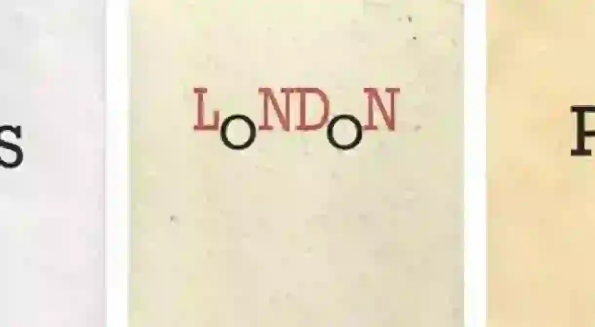
Paris, Pisa and London by Penguin
Publisher Penguin have a penchant for clever book designs, and this travel trilogy doesn’t fail to impress. Subtle yet incredibly clever, the typography is used to symbolise an icon of each city; the leaning ‘I’ represents the tower of Pisa, the ‘A’ in Paris is elongated to appear like the Tour Eiffel and the double ‘O’ in London are lowered to look like the city’s iconic double-decker buses.
Jaws by Peter Benchley
You can almost hear that heart-thudding ‘da-num’ Jaws theme tune as you look at the illustration of the classic novel. The viewer sees the swimming woman from the viewpoint of the ferocious-looking shark whose enormous head dominates the page. We all know what happens next…
1984 by George Orwell
The story of Big Brother surveillance has had many great covers, although the creepy red-and-black number from 2008 does well to capture the terror of the all-seeing eyes that are following us everywhere.
South of the Border, West of the Sun by Haruki Murakami
Artwork designer John Gall has been chosen to illustrate many of Japanese writer Murakami’s best-selling novels and his thoughtful and vibrant ideas never fail to appeal. The warm colours of the man and woman’s skin and their parallel eyes create something beautiful and intriguing – just like the writer’s words within.


