
With Russia 2018 releasing its official poster ahead of next year’s World Cup, we decided to go through every poster in the tournament’s history, sorting the dull from the delightful.
21. Germany 2006
Why’s it in space? Is the idea supposed to be that the World Cup is bigger than the world? Or it creates its own world? Who knows. It’s dull, unimaginative and has nothing to do with Germany.

20. Brazil 2014
Like marking a primary school maths book – you can see the reasoning and the working out, but the end result isn’t what you want. Feels a bit like its the logo for an advertising agency, rather than any sort of carnival of football.

19. Mexico 1986
It may have been commissioned by Annie Leibovitz, but the final product appears to be the neglected love child of clip art and Photoshop. Mexico 86 was such an exciting tournament, but it was slightly let down by this monstrosity.

18. France 1998
Wow, that’s a lot to take in. In it’s defence, it’s very 1990s and includes a hefty dose of Gallic colour, but it all contributes to quite a messy result. Just put the pen down and walk away.

17. USA 1994
Space, again, this time courtesy of New York artist Peter Max. The USA are usually so good at doing things all ’murican, with plenty of razzmatazz, pride and and unashamed patriotism, and yet this has none of that.

16. South Korea/Japan 2002
It’s supposed to be ‘football-related brush strokes’. It’s actually thoroughly forgettable.


15. Sweden 1958
Yeah, it’s fine, in that it has all the components that you might want – football, flags, colours – but they don’t add up to much. It’s all a bit disjointed and muddled and, while it’s not offensive, it’s not particularly exciting either.

14. Chile 1962
Space. Why are we back in outer space? It’s the best out of the galactic offerings thanks to the simplicity and the red strip of the host nation peeking up from below, but we’re struggling after that.

13. South Africa 2010
Aside from from some smaller splashes of colour, the predominant black and yellow works, and the head at the top of the map of Africa is an aesthetic success. A good, solid effort, but no more.

12. Argentina 1978
Now we’re starting to get somewhere. The same pale blue that’s become synonymous with Argentina’s beautiful home kit. Simple colour scheme, footballing imagery and more Argentine than a gaucho eating steak on a polo field.

11. England 1966
Mascots for major sporting events are, on the whole, hideous, but World Cup Willie bucks the trend. Although it loses points for not actually having the correct flag, there is still something incredibly endearing about this.

10. Italy 1990
Presenting something that clearly represents your country, without reverting to cliché, is a tricky one, but this manages it. Dark and dramatic, it’s unlike anything else in this list and, while hiding the ‘Italia 90’ font is a brand nightmare, this is still a favourite.

9. Brazil 1950
This shouldn’t really work, with the insistence of having every competing flag represented within its design, but there is a certain charm to it. Something you’d expect to see on a nostalgic, football-themed cartoon after school when you were young.

8. West Germany 1974
Painted by impressionist Horst Schäfer, it’s very close to being brilliant, but just misses the mark. The featured footballer’s lack of of a head makes it look slightly robotic, which is at odds with the brush strokes.

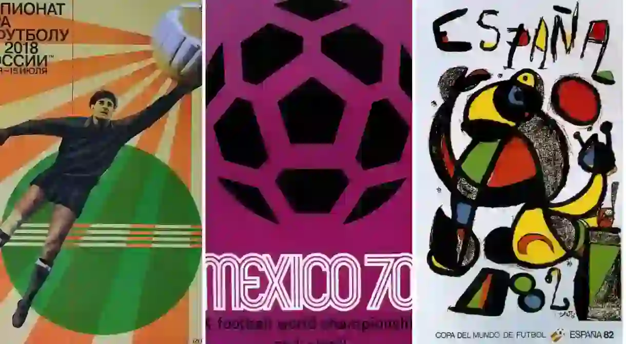
7. Mexico 1970
And now a heavyweight enters the competition. This genuine darling of design is simplicity personified. There is nothing ‘Mexican’ about it, but that font is straight out of the top drawer. The end result is understated and beautiful.

6. Spain 1982
Just look at it, it’s so Spanish. Painted by the Catalan surrealist Joan Miró, this was an instant hit when it was released. For many, it should be higher up the list, but there is a disconnect between the design and football itself. That said, it arguably represents the host nation better than any of the others.

5. France 1938
A domineering piece of propaganda that shouts at you to tell you it’s amazing, and you believe it. Very much of its time and like an Art Deco dystopia, it’s grand and powerful. Dislike it at your peril.

4. Switzerland 1954
Featuring goalkeepers, as you’ll see, will get a poster high up on this list. It’s comforting, somewhat enchanting and one of the few posters to actually feature a person’s face, even if it is half in the shade.

3. Italy 1934
Similar to France’s effort in 1938 (above), it’s Art Deco fascism in full effect and everything you’d expect from a vintage sporting poster. Its creator, Gino Boccasile, was a favourite of Benito Mussolini and became a big part of the Italian art movement of the time.

2. Russia 2018
This, ready for next year’s tournament, is almost fantastic enough to forgive the alleged corruption, bribery, hooliganism and doping allegations surrounding Russia 2018. After quite a lot of recent duds, it’s a wonderful throwback. Lev Yashin, whose image features on the poster, would be proud.

1. Uruguay 1930
The original, and still the best. It’s so, so handsome. Long before official logos, mascots, sponsors and everything else, this ambitious effort launched the whole thing. According to iconic auction house Christie’s, an original version could set you back £20,000. Worth every penny.

About the author

Luke was born and raised in various parts of south London, before studying Politics and Social Psychology at Loughborough University. His time in the midlands was limited to his study and upon his return to the capital (via the obligatory travelling in between), wrote for a number of different local and national publications, before moving into the editorial side of things. Aside from the obvious interest in sport, he loves food, travel, reading and film, but if any can somehow incorporate sport in the process, then all the better.
Read Next

The Best Spring Break Destinations in Europe

The 10 Best European Museums for Contemporary Art

36 Natural Wonders in Europe That Will Take Your Breath Away

The Most Scenic Train Journeys You Can Experience in Europe

25 Places in Mediterranean Europe You Must See at Least Once in Your Lifetime

18 Incredible Places in Europe You Never Knew Existed

The 15 Most Beautiful Lakeside Towns and Villages in Europe

Beautiful Cities in Eastern Europe You Must Visit at Least Once in Your Lifetime

The 10 Most Beautiful Opera Houses Around The World

10 Russian Swear Words You Need to Know

Where to See the Last Imperial Fabergé Eggs Around the World

The Best Places to Travel in May
