10 Things You Should Know About Mark Rothko

A deeply philosophical man who eschewed materialism and insisted on the primacy of raw emotion, perhaps we could all do with a bit more of Rothko’s principles in our lives. Here are 10 things you should know about the artist, including what his greatest fear was.
Individual experience is key
Rothko strongly believed in the importance of the personal experience of individuals to his paintings. In his vision, the viewer would be drawn into a deep, meditative relationship when faced with the canvas, a state of emotional vulnerability and total receptiveness, analogous to Rothko’s emotional state as he painted the canvas in his studio.

The master of color wasn’t “interested in color”
Since his untimely death, Rothko’s pioneering of the Color Field movement has been described by many critics as indisputable and groundbreaking. To the painter himself, color was only a vehicle towards an emotional reaction evoked in the viewer, striped of any aesthetic or decorative undercurrent. In a famous statement that embodies his artistic practice, Rothko said: “If you are only moved by color relationships, you are missing the point.”

The only response that matters is emotional
Rothko was preoccupied with raw human reaction, or what he called “basic human emotions—tragedy, ecstasy, doom and so on,” and found this to be the only ‘right’ way to react to his paintings. As she approaches the canvas, the viewer must rid herself of the desire to interpret, or understand, the painting in an intellectual sense, and allow herself to be moved by the emotion engraved in the composition. Ultimately, Rothko saw this as a state where painter and viewer share a set of emotions, almost transcendentally, while facing the same canvas. Within the context of the increasingly intellectualised art of the 1950s and 1960s, this approach was not only original but also controversial.

Refrain from calling his paintings “beautiful”
Having his paintings serve a decorative purpose was arguably Rothko’s greatest fear as an artist. Whenever he sold one privately, he first studied the buyer’s reaction to the canvas in an attempt to gauge whether the new owner would use the painting as an accessory, or a centrepiece. Although there is an indisputable beauty to Rothko’s towering, hypnotising works, his prescribed way of looking at them is to empty your mind of any aesthetic consideration, and perceive them to be moving, both literally and figuratively.

Rothko’s early works are figurative
His early works are decidedly figurative, a far cry from the vast, abstract works he eventually became known for. Subway scenes, interpretations of ancient myth, semi-human figure studies and pastoral settings come together in an eclectic mix of seemingly unrelated subject matter, before becoming blurry abstractions in the next stage of Rothko’s development. The one link between these, and his later works is the painter’s visible penchant for the upright—vertical lines, bodies extended upwards, and omnipresent columns all anticipate Rothko’s mature works.

Black is never really black
More specifically, the black used by Rothko is a multi-dimensional plane of dark hue, usually placed atop, or next to, a different tone that imbues the rest of the painting with a very subtle coloration. Even in the late, typically dark works, the layer of black is punctuated by semi-apparent flashes of color from underneath, fighting for air from beyond the initial impression.

Rothko’s paintings are among the most expensive artworks ever sold
Rothko’s Orange, Red, Yellow (1961) is among the top five most expensive post-war paintings ever sold at auction. It fetched an extraordinary $86.9 million at a Christie’s New York auction in 2012, beating the artist’s previous record with White Centre (Yellow, Pink and Lavender on Rose), which was bought for $72.8 million at Sotheby’s in 2007. To put this into context, Van Gogh’s Irises (1889) sold for a ‘mere’ $53.9 million in 1987.
Money was never a drive for Rothko
Despite the record-breaking prices fetched by his paintings in today’s art business, prosperity and fame were never among Rothko’s priorities. The so-called Seagram commission is one spectacular example: in June 1958, Rothko accepted a commission from the owners of the new Four Seasons Restaurant in New York to produce a set of murals for the interior, and to complement the all-star cast involved in the restaurant’s design, complete with Mies van der Rohe and Philip Johnson.
After initially accepting what would have been his most lucrative assignment, Rothko broke off the contract abruptly, with little explanation. It is suspected that he thought the project would compromise his integrity as an artist, and render his paintings purely decorative within a luxury dining setting.

Rothko’s later works gravitate towards darkness
During the later stages of his career, in the 1960s, Rothko’s paintings began to veer towards darkness, a complete shift from his earlier focus on vibrant canvases where color seemingly took centre stage. Dark grays and near-blacks began to dominate his palette in what many now see as an omen of his suicide in the winter of 1970. Astoundingly, his final work is a screaming composition of blood reds.

Mondrian and Rothko have more in common than you think
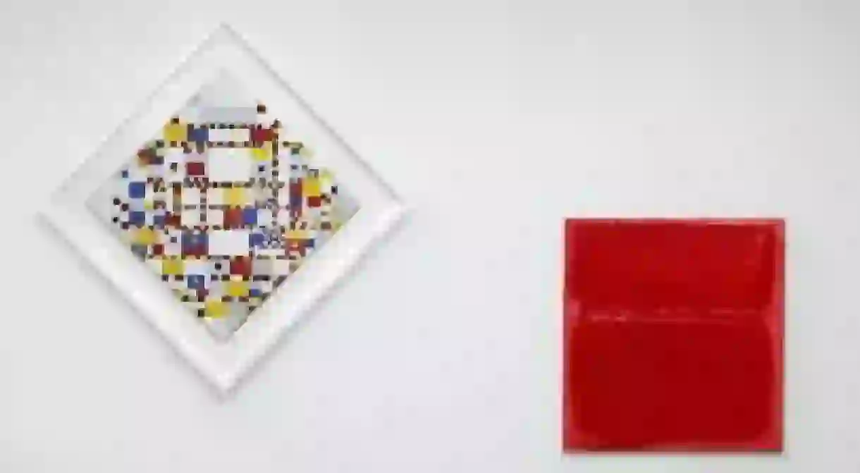
There is a real, tangible relationship between Piet Mondrian and Mark Rothko. Their works share an emotional intensity, an undercurrent of raw feeling dictated by the use of shape and colour, structure and consistency that defines them both. The Hague’s Gemeentemuseum’s juxtaposition of their final works—Rothko’s Untitled, (1970) and Mondrian’s Victory Boogie Woogie, (1944)—in a 2014/15 exhibition, was both unexpected and yet perfectly vital.


