You'll Never Look at the World the Same Again After Seeing These Maps

No, really. These fantastical maps actually do put the whole world into perspective.
If you’ve ever visited TheTrueSizeOf website, you’ll know one thing: the interactive map shows just how ginormous some of the world’s most famous nations really are.
The major reason as to why some countries look bigger or smaller than they are, is because of a certain controversial map: the Mercator Projection. Back in the day, cartographers found it very difficult to plot our 3D planet onto a two-dimensional map. That is, until Flemish geographer Gerardus Mercator came along in the 16th century, and created a fine map that could be accurately used for naval navigation.
The problem? The whole thing actually distorted the true size of continents, later leading to accusations of eurocentrism in the 20th century. The distortion arose because the map plotted the Earth’s landmasses depending on their position relative to the equator, which made places like Greenland look way bigger than they actually were.
To set the record straight, take a look at these maps below.
Who would have thought the USA and Down Under were the same size…

Looks like China, India and the USA comfortably fit into Africa…

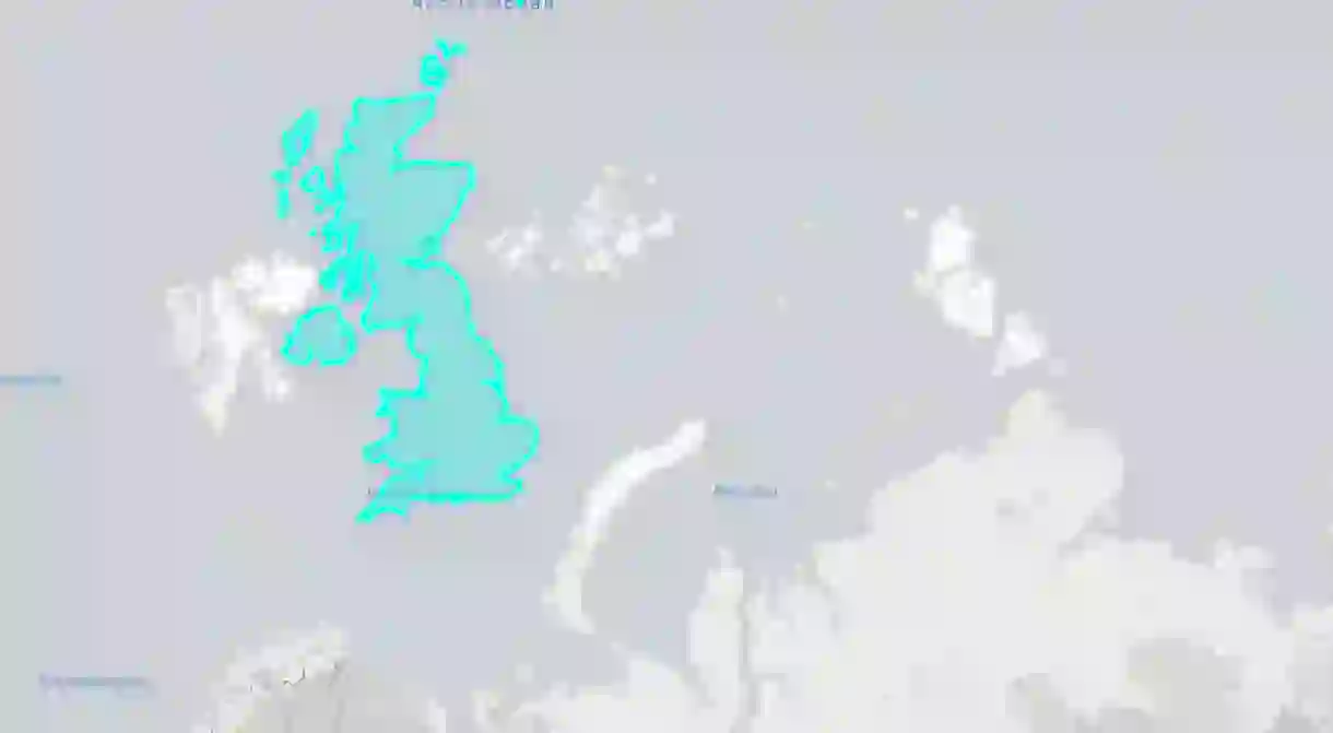
Doesn’t the UK look absolutely massive in the Arctic Circle?


And if you put China over North America, it looks the size of Jupiter…

Well, Peru certainly looks bigger when it’s plonked right on top of Antarctica…

Speaking of Antarctica, seeing it in the North Atlantic kinda puts it into perspective…

And rather than being the same size as Africa as Mercator would have us believe, Greenland is nothing but a speck in comparison…

Discover just how big your country is on thetruesize.com.
Love maps? This one shows you the world’s favourite books!
About the author

Luke Abrahams is a born and bred Londoner and is proud to call the capital his home. He mostly writes about popular culture trends and pugs but isn’t afraid to tackle food, art and style from time-to-time.
Read Next

The Most Scenic Train Journeys You Can Experience in Europe

The 15 Most Beautiful Lakeside Towns and Villages in Europe

The Best Places to Travel in May

Best Places to Visit in July this Year

18 Incredible Places in Europe You Never Knew Existed

The Best Spring Break Destinations in Europe

The Best Places to Travel in September

The Best Places to Travel in August

The 10 Best European Museums for Contemporary Art

The Best European Cities to Visit in Spring

The 10 Best European Cities to Visit in May

Beautiful Cities in Eastern Europe You Must Visit at Least Once in Your Lifetime
