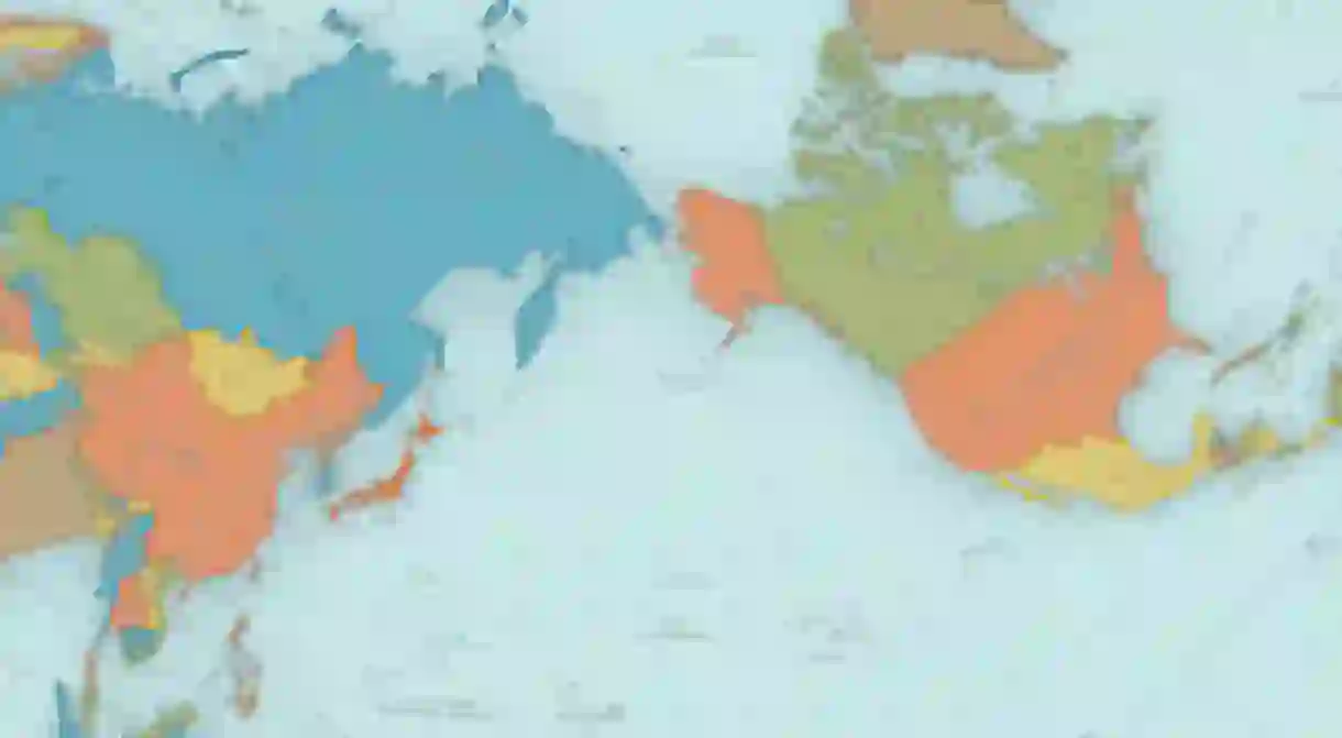
This Shocking Map Shows What the World Really Looks Like

Everyone, your books, your globes and your teachers have been lying to you for years.
A very clever Japanese architect who goes by the name of Hajime Narukawa has claimed to have tackled a centuries-old problem – how to draw an oblate spheroid on a flat plane. A what? Yes, it is a huge gobful, but he thinks the map below (dubbed the AuthaGraph World Map) will revolutionise how we perceive our planet.

First drawn in 1999, the cool projection frames the world’s landmasses in a 2D rectangle. Why? To represent their relative sizes as accurately as possible.

Narukawa achieved this by dividing the world into 96 triangles, making it a tetrahedron, then unfolding it to become a rectangle.
Unlike the traditional Mercator projection, which was put together in the 16th century, and exaggerates the size of northern areas like Greenland and minimises places like Africa, the continents on the AuthaGraph World Map are the same size as as their 3D projection, and thus make our world look that little more accurate.
Mind Blown.


